Consistency, everyone can make it

People talk too much about Consistency — one of the key principle of UX design. However, how much do we understand ‘consistency’, how much do we understand way to use consistency and how to keep it in our product designs without breaking it?
What’s consistency?
Let’s drink some coffee and talk about ‘consistency’ today.
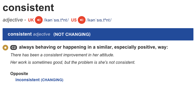
People talk too much about Consistency — one of the key principle of UX design. However, how much do we understand ‘consistency’, how much do we understand way to use consistency and how to keep it in our product designs without breaking it?
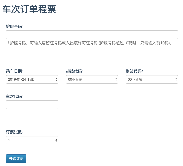
It was a time I visited a Chinese website to buy a train ticket. I can (not really easily) complete the buying process without understanding any Chinese language. How can I do that?
Keep things consistent, it’s not about we make things exactly the same as previous behaviors, it’s about make things happen in a similar and POSITIVE way.
Consistency helps people to adapts new contexts and learn new things quickly without pain. Therefore, they can focus on executing the task and not learning how the product UI works every time they switch the context.
Why we need to keep consistency.
Let’s see following benefits:
- Saves money and time! Start building your product from predefined components so that you can have more time to make great ideas, super features and make incremental improvements instead of walking day by day just to design how the login form should be. Furthermore, consistency allows designers and stakeholders to make decisions quickly without spending precious time to argue.
Mr. A: This button should be in Blue;
Mr. B: No, no! I think Yellow is more beautiful…
We don’t want the meeting discussion to be like that, do we?
- Enable users to learn faster how to use your design. Consistency helps to reduce the learning time for a product since user gets familiar with the given experience. Having inconsistent interface is like trying to communicate with the user in several languages. Back to my example at the beginning of this article, I don’t need to understand what does ‘Submit’ in Chinese, it’s simply a ‘blue’ button.
- Eliminates confusion! Imagine that you are building a really cool ‘Add to cart’ feature, definitely there are many steps to complete the journey; but it would be a worst case when we make the user feels confused what should to do in next step (such as how to checkout or how to make a payment), do you think how many paid order there are?
Before discussing how to make our product consistent, let’s quickly separate consistency to 4 levels:
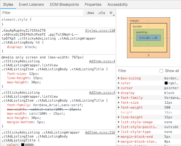
Level 1 — Visual consistency. Very first level, similar elements that are perceived the same way make up the visual consistency. It increases learnability of the product. Not very hard, it’s just fonts, sizes, line-height, margin, alignment, buttons, labeling and similar need to be consistent across the product.
Level 2 — Functional consistency. Not only similar elements but also similar controls that are functioning the same way make up the functional consistency. It increases the predictability of the product. Predictability leads to users feeling safe and secure.


Level 3 — Internal consistency. Combine of both visual and functional consistency in your product design. It improves the usability and learnability of the product. Even when you introduce new features/pages users will have easy way using them as long as you keep the internal consistency.
Furthermore, consistency could be in process on how we building software. Simple example, modern software development process called “Scrum Agile”, where the Daily Scrum is held at the same time and place each day, main purpose is to reduce complexity, etc… Maintaining activities consistently helps organization and team members simplify their workflow and process, and not waste too much time for thinking how to make it in daily work.
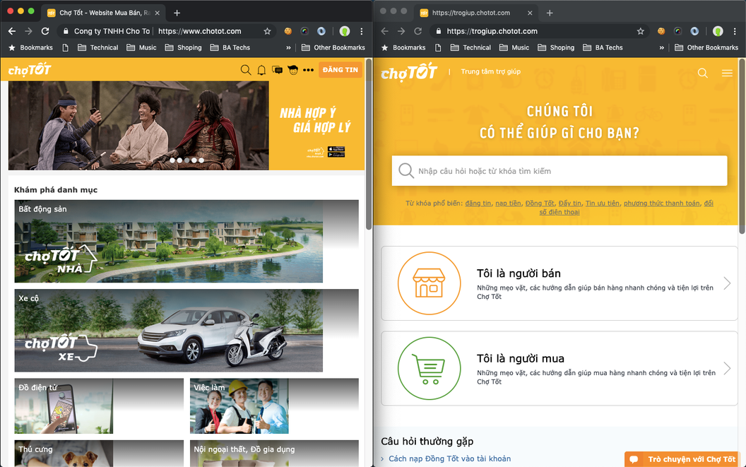
Level 4 — External consistency. This type of consistency is achieved when there is design consistency across multiple systems/products. This way the user’s knowledge for one product can be reused in another. Yes, this helps eliminate a lot of the friction and provides great user experience.
An example, in Cho Tot, we do have the application in 3 platforms: Web(Desktop and Mobile site), iOS app and Android app. Definitely, these looks and feels are always kept consistent. In addition, we do have others site to support the operation, such as Career, Help Page, Event Page (for marketing purpose), etc… so what? Our designers also don’t have to spend much time to design new looks and feels for these, just invest on improving UX and usability. Life’s much more easy.
In fact, strictly keep design consistent is alway easier said than done. We sometimes break this principle (accidentally or going all creative and artsy). There will be another topic to clarify creation vs. consistency, but in this topic, I will try my best to scope it down to the most important ways to keep consistency in our designs without breaking it.
UI Guideline. A simple way to ensure consistency throughout our products is to maintain a UI guidelines and follow them while designing the experience. For instance, at Cho Tot, we do have a great design guide where people easily access to predefined elements, including typography, colors, grid, size, position, etc… without thinking too much. Kindly refer to a short demonstrate at the end of this article.
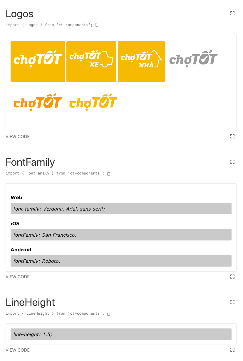
Unfortunately, not all the time we are able to define these elements (or have enough time). Simply reuse predefined elements by other big giants. Here’re some example:
- iOS: https://developer.apple.com/design/human-interface-guidelines/ios/visual-design/adaptivity-and-layout/
- Android: https://developer.android.com/design/handhelds/
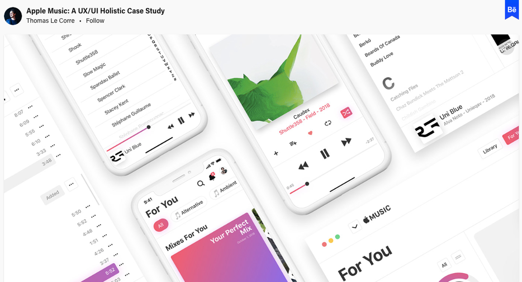
Inherit from familiar patterns. People who will be using our designs be it digital or not, have been around for some time. This means they have experienced and learned other designs, and know the patterns used in them.
Below are some samples:
- https://pttrns.com/
- https://www.mobile-patterns.com/
- http://ui-patterns.com/patterns
- https://www.behance.net/
- https://dribbble.com/
Keep product’s style consistent. Keep your product’s style consistent, use one voice and tone throughout the product and user flow influences.
For example, you manage push notification or email template.
To be considered
Some designers ask a very good question: if we keep things always consistent there will be almost no innovation?
Consistency is a not a barrier to innovation, but making consistency a priority while thinking about innovative design ideas is the secret to success. The ‘secret’ here is we first need to learn and understand the rules before bending them. Keep in mind, bend not break them! Broken consistency equals broken design and user experience.
Can consistency be maintained and improved?
Yes, consistency can be extended by adding new behaviors to design experience. And the best way to do this is keep collecting user feedback.
Listen and understand our users. Most design decisions should come from that understanding. Make adjustments to the already established and consistent design system only when they are informed by your user’s needs.
Making these small changes will evolve the product into a better version and will keep the consistency.
Conclusion
Even which design principles, the most important thing is how we bring values to our customer. Therefore, apply consistency to inspire customers and understand user expectation.
Last but not least, remember, little change is good, more change is not necessarily better! Create consistency to improve usability and to create delight by reducing unwanted surprises.
References:


